


Vote Which Logo I Should Use! :d
Business By pieceofcake561 Updated 14 May 2012 , 2:31am by pieceofcake561

Taking a vote!
I am trying to decide which logo to use for my upcoming bakery.
Piece of Cake Bakery will offer customizable cakes, cupcakes and cookies. Customers will have the ability to personally design cakes to complement their special occasion. This includes everything from tiered wedding cakes to one of a kind 3D birthday cakes.
Please vote for the logo you like best (#1-#7). Changes in color or font are possible so let me know why you like/don't like the logo.
Thanks SO much!!!! ![]()
(logos created by www.gddesignstudio.com)
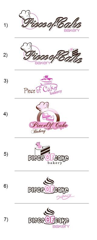


I find the font on 1 and 2 hard to read and I agree with the others that 6 and 7 look more like a coffee shop. I voted for 4 but also like 3

I voted twice not sure if it will count it or not. I voted for 1 and 3 the only thing I dont like about #2 is it looks like the word cake is falling off of your sign but I like the piece of cake logo since that is what you are going for.

I voted for #3. I like the simplicity of the line drawing. I don't think the legibility will be a problem when the logo is blown up to the size you would normally use, and I'm very partial to a more minimalist kind of design. Best of luck with your bakery!

I'm with Ranae...#4 and center the Bakery.
Must be exciting to picking your "look".
Good luck with your venture. 
mommachris


I'm not a big fan of the script, I think it looks a little dated. #5 is my pick, it's the most readable and should scale up nicely.

I voted for #1 but I would like it better if the chef hat was replaced by the cake slice.
#2 is too droopy looking and I liked #3 also but it reminds me of pancakes somehow.

Number 5 was my favorite, but I'm not a fan of the typeface for Piece of Cake. It just looks kind of juvenile and bubbly. Number 4 has potential, but I would lose the chef's hat, change the picture to one piece of cake (after all it is the "Piece" of Cake bakery ![]() ) and also change the typeface to something a little more modern.
) and also change the typeface to something a little more modern.
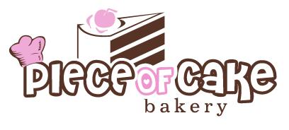
Wow! All of the comments are SO helpful. I would have never thought about the diamond ring, the pancakes & the coffee cup. Thanks so much everyone!! I'll post the final logo as soon as it's completed ![]()
I wasn't going to say anything, but if I were you I'd want to know this. I don't mean this to sound rude but on a quick glance the script in the first samples, I didn't read it as "Piece" but something that started with P and ended with "ss" (with one letter in between if you get my drift). ![]() I had to look closer to read it correctly. I KNOW that's not the first impression you're trying to give so I figured I would share that with you.
I had to look closer to read it correctly. I KNOW that's not the first impression you're trying to give so I figured I would share that with you.
I also wouldn't go for a cupcake swirl design f you are called "Piece of Cake" - better to stick with the piece of cake, no? I agree with the others that you need a simpler, more modern font to go with your cake graphic. Perhaps put the "of" in the middle of the cake, but in a way that the slice is still visible? It is really hard to come up with a good logo. You might want to browse on Etsy as there are lots of good designs there which may give you ideas. Good luck.
Sorry it has taken me so long to post this. Thanks everyone for all of the votes and opinions. After tallying everything up here & in other votes taken, the winner is #5 (with a few alterations ![]()
Quote by @%username% on %date%
%body%