


Totally Looking For Some Validation!
Decorating By MamaMia808 Updated 25 Jan 2012 , 2:18pm by belle76

Ok, I'm gonna be shameless but I really need some feedback on my dessert table (black and white in pics) that I made for a recent expo. I ask because the reaction to this one wasn't like my last one (blue and white) and I need to figure out if it was the color or the general design.
Oh yeah, and I don't mind any raving compliments either! ![]() Just kidding!!!
Just kidding!!!
Anyway, I really appreciate any feedback! Thanks!!!

Tough crowd! I think your cake and setup are gorgeous!

I think it looks very well balanced and I love your cake pops! I love the contrast with the black and white. However - - and I wouldn't say this if you didn't ask for comments - - it does look a little bland as far as color. And it looks rather formal, like nothing should be touched. Which would kind of defeat the purpose if any of it is for sampling.
That being said - *whew* - I think it's absolutely beautiful and you did a gorgeous job! 

Just took a quick look. You've got tremendous talent and I think your work is beautiful. I think the lack of color is what's missing since the design structure of it looks great. Hope that helps!
I agree.

I think it's just the color combos. Black and white is very formal and so you don't get a lot of "fun" play with the different candies and other goodies.
Also, I would add more goodies to the table. I know it was just for a display, but I would totally pack it with sweets like you did with your multi-colored table (which is awesome, by the way).
Great job!
When I looked at it I thought it was well executed from a design standpoint but something was bothering me that I could not put my finger on until I read the other comments. It does seem a bit too formal given the color palette. To be clear black and white one is one of my favorite combos--I think in part because of the formality/elegance they exude. T
he black and white is so dominant the pink accent almost fades from the scene. Anyway I think it is beautiful and well done, but if folks were looking for something more playful/whimsical it might explain why they were not wowed by it. (From my reading of the post it did not seem like you felt people reacted negatively to it only that you did not get as many positive comments as the blue and white display--which I kind of wanted to see).
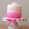
My one comment goes along with the others. It's beautiful but I think you need a bolder accent color. I'm also not loving the flowers...I love hydrengas but since they are not white white I think they take away from the display. I would have gone with something in the pink family to pull in some more color but your work is really beautiful. All of your dessert tables are fabulous!
Quick question how do you get your swirls on you cake pops so pretty? Mine always come out wonky.

I love your display and the cake. I saved it before I found this thread. That said, I think it would be more inviting if the pink were a hot pink. Hot pink, black, and white are a striking combination and less formal. Also agree with sillywabbitz about the flowers.
Your work is fantastic--no negative comments there!
Thanks for the feedback! I'm gonna have to search for just the right color combos before the next one. I think you're all right, I need more color.
Sillywabbitz: I just thin the chocolate out really well and turn the pop on its side and spin as I squeeze the chocolate out of a bottle with a plastic tip. Does that even make sense? ![]() If that was as unclear as I think it was PM me and I'll try to send you some pics of the process.
If that was as unclear as I think it was PM me and I'll try to send you some pics of the process.
That makes perfect sense. Do you use the wilton bottles? I may have invest, I've tried piping bags, forks...but I haven't tried the bottles. Thanks for the tip.

I agree about the hydrangeas...everything else was fabulous, but the hydrangeas took away from the overall look somehow.
Quick question how do you get your swirls on you cake pops so pretty? Mine always come out wonky.
I'm wondering the same thing - - they're beautiful. My dh is working on a tiny motorized turntable for me for decorating cake pops, so maybe I'll be able to do something like this. ![]()
I don't use Wilton ones but got some from CK that has a screw cap that can take the plastic piping tips.
jgifford: you don't need a turntable! Just hold the pop horizontally and spin the stick. ![]()
Hope that helps! Good luck!
Thanks again to everyone for the feedback! It really helps!!!
I don't use Wilton ones but got some from CK that has a screw cap that can take the plastic piping tips.
jgifford: you don't need a turntable! Just hold the pop horizontally and spin the stick.
Hope that helps! Good luck!
Thanks again to everyone for the feedback! It really helps!!!
What? And deprive my dh of the opportunity to build something? Never! ![]()
I disagree with everyone. I like that pink with the black and white. You can never go wrong with any accent color to black and white. My wedding colors were red, black, and white so obviously I like the b&w theme. Here I think this shade of pink softens the contrast between the b&w and I even like the hydrangeas as the color ties in the softness of the pink and compliments it as well as they tie in with the fluffiness of the tissue paper pomanders at the top. I love the look overall and if I had found you at one of the many bridal shows I went to while planning my wedding, I can honestly say I would have booked you! Keep up the amazing work!!

You did a beautiful job on your arrangement and presentation. Is that a touch of pale pink I see to go with the b&w? I personally love this color combination, especially for a wedding. A pop of brighter color maybe would have been more eye catching and maybe a little more festive.

I love your black and white dessert table, maybe even a little more than the blue one, are you talking about feedback on here, or at the bridal expo? I noticed a lot of people favorited the blue one, I think with cc it depends on the time you put your picture in because if someone doesnt specifically search for your cake they only see it in the recent photos section and Im pretty sure most people just look at the first or second section of that, I've seen really nice cakes that must have somehow gone unoticed because they only have been favorited by a few people. I will admit that when I post a cake that is viewed and favorited a lot it makes me feel really good, especially from here since there are so many great decorators on this site ![]()

I agree that your table display was beautiful. I also agree that the pink was washed away by the black. If you had used hot pink instead of light pink it would have popped. Even a bright lime green would have been pretty against the black and white. Also the hydrangeas were just there. They were pretty...and I love hydrangeas...but if they weren't white-white, I would have gone with something like hot pink gerbera daisies....if you could find them that is! But it was beautiful none-the-less!

Beautiful work, clean set-up, but colorwise - boring. After looking at the display my eyes kept going to the hydrangeas on either side and that's not where you want your customer's eyes to go. Not trying to be brutal, just brutally honest. Hugs, Denise
Your work is beautiful! I think a black and white theme is very formal and it's been pretty popular in weddings lately. The one thing I noticed that seemed a little distracting to me was the black back drop. It seemed a little heavy. I also think the hydrangeas were pretty and matched the vanilla cupcake, but it might have blended a little better had they been pink to match the other pink items. Overall it was lovely! I think it was just an off day!

You are very talented in everything you do. I have one of your pictures saved already and I'm glad I looked at the rest. You did a wonderful job. I think the black and white is formal so it's a good example for a wedding but the light pink shows it could be for a birthday as well.

I'm also thinking the hydrangeas were not quite the right accent. Everything else was black, white, or that pale pink. The flowers were yellowish, and didn't really match anything else. A pale pink flower might have pulled out that pink on the cake.
That being said, that is an absolutely beautiful arrangement of goodies. The swirl of color on your cake pops is perfect, and the fantasy flowers on your cake really pop.
Okay, now that I've seen all the pics., I don't like the hydrangeas. I love the shade of pink, so I am thinking maybe peonies should have been used. I still think you table is beautiful and you have a great eye for design. I can't put a table like that togther!
Quote by @%username% on %date%
%body%