

I finally did it. Take a look and tell me what you think.
www.batterupcakesllc.com
Suggestions appreciated.
I think it looks great! I love the colors.
I don't think you need to say that you need two weeks but once. That should be enough. The only thing I noticed on your flavors... it looks like the font for the "Dark or Milk Chocolate" ganache was a little bigger than the rest of the font. Maybe I'm imagining it though.
I think its great though! You did an awesome job! 
Thanks Meri1028,
I;ll check on the font size - it does look a little different.
Where do I have the 2 weeks notice twice? Thanks again for taking time to look & comment.


i opened your site, but it flashed up that it is a suspicious site.... promptly closed im afraid!
xx

All I am getting when I click your link is a black screen with a little red x where i think an image is supposed to be? I'm going to try to attach a screen shot....
Thanks for the info -- The site does use Flash so you must have that installed. Are you using the latest version of IE? Thanks for trying.
As much as I hate to say this I think that it needs to be more customer friendly in like the "we would really love to be part of your special day" kind of thing. I am not having any kind of trouble when it comes to navigation but it definitely needs to reach out and grab attention more.
Like here we are, this is it, this is what you can have and you know you want it.

I think it looks great, but I myself would take out the part about baking the cakes 2-3 days in advance. Whereas most people wouldn't even think about it, after reading that they're probably thinking "So I'm gonna be paying for a 3 day old cake?". I think simply stating that the cakes are baked to order sounds better. Just my 2 cents ![]()
Thanks DelectabilityCakes -- It is rather impersonal. Ill work on that. Thanks for the recommendation.

Ok, so here is what I noticed:
The pic on the home page is fuzzy--also, and this is not meant to be mean, but it looks very old fashioned. Was it taken recently? The colors and layout remind me of something I might see in my mom's cookbook.
The logo for the WIX is in the way, and very distracting for me. Can it be removed? It also makes me wonder about the professionalism of the company if their website is advertising it's "building program".
In your collection, there is a Spiderman cake and a cake with the Disney princesses, those need to be removed ASAP. They will get you in BIG trouble. Same goes for the Dr Suess and Pokemon.
I agree with the PP, it doesn't appear that you are too excited. Nothing fancy, here we are . Why would I pick you over anyone else.
I think that you have a good start with the colors, font and layout. I think that that pics (pic, not cake!) could be better, but you've got to start somewhere.

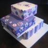
I agree with what jillmakescakes said about the photos (cakes are great!)
Also, and this is a small and rather picky thing on my part, your proverb on your Contact page isn't actually an American proverb. It's from Epicurus (BC 342-271) and was obviously originally in Latin and has been translated often into English. There's also a version of the same quote in the Bible.
As I say, I'm being picky!
Overall, your website is really good. I know how much work goes into building them and how proud we are when they're up and running. So well done!!

Love it. Very clean and simple. Good luck!
Sugarandslice - the quote actually comes from Isaiah 22:13.
Hey ThecookieLadyCC - just took a peek at your site. LOVE, LOVE, LOVE it. Wix makes it easy.
good job Poodledoodle.I am working on my wix website, I love websites created with wix.

I'm sorry to be Debbie Downer here, but the font is horrible. I have great eyesight & had to almost have my face in the monitor to read it. I have a laptop but you should want everybody to be able to read it & I can't. The font also runs together & makes it even harder to read.
I agree the pic on the opening pg seems a little old fashioned & don't know if you noticed when you took the pic but there are basketball goals in the background!
Maybe on the flavors pg give a brief titilating description. Make people think they HAVE to order THAT cake. Plus it helps keep your ? answering to a min. e.g. What's the difference between buttercream & velvet buttercream.
And licensed characters can get you into trouble if you don't have permission from the company & you don't want fines &/or lawsuits.
I'm not being rude. I would absolutely want someone to tell me what they liked & didn't b/c you want the best & remember your web page is a selling point. you want it to be appealing/appetizing/suck you in etc. It is very easy to navigate & the cakes look great!

Great start! I think it's a nice layout, and the font/main picture doesn't bother me at all. I do agree that you should take off "We bake 2 to 3 day prior to delivery depending on size and decorations," for the same reason that's been mentioned before.
As a customer, the first thing I'd be curious about is your prices, so including your base prices would be helpful.

Quote by @%username% on %date%
%body%