

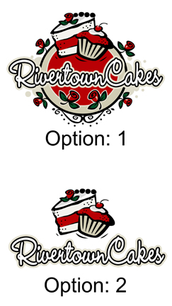


I have a degree in marketing and I like them both but If I were trying to market your business the simple logo would be my pick. I would just tweek it a bit. I would color in the writing with red and leave the rest alone. Let me explain my train of thought... The 1st one is too busy and while it is very pretty people would remember the design and not yor name... (you want people to remember your name). So you want to UMP up your name!!! I hope this helps but you know what they say about opinions....LOL


Do the second one with your words colored in red.
I love #1, but think it is too busy. You are going to want something that is clean and easy to read. Also, #2 will be easier to imprint on things (Shirts, aprons, pens, ect..)
I love both of them, and my first thought was to use both of them but for different purposes. I was an office manager for a printing & publishing company before becoming a SAHM earlier this year and I worked with many a logo! I found that some logos were frustrating to work with and others were easier.
I personally love #1 the best, its very fun! But you may find it harder to work with on your business documents if you want your logo printed on them. But it would be fun on a business card if you keep in big and keep it to one side with your contact info beside it. Or on the shop front. Or on the menu board. Stuff like that where you can keep it big and bold.
#2 will lend itself better for printing and fitting onto things like your invoices, reciepts, gift certificates (if you are going that route). Generally these type of things only give you a small flat-ish spot for your contact information, and logo#1 is round, so it may be too small to read when squished into the height restrictions. #2 is flatter and will be perfect for your documents.
So my vote is BOTH if you are able to. They are similar enough that people will still recognize both as your logo (another problem I ran into was businesses wanting 2 logos, but were so different from each other, people thought they were 2 seperate businesses... but your's would cause no confusion).
I hope this helps! I really do love both!
Thank you for all the opinions so far! I really liked both and had a hard time deciding. I can see the benefit of simple, but liked the Wow factor that #1 had. I was actually thinking along the same lines as scrapperjade said, using both, but for different reasons. I was going to design my business cards today and work on getting a website together, so wanted to get a feel for what others thought.

They are both very pretty, but the second one is definitely more effective as a logo. I would also suggest coloring your name. If you did it a third color, your name would stick out even more. I would also add just a small something under the name. Maybe some kind of simple scroll or design.
Because of this time of year.....when I glanced at the first logo, I immediately thought "Christmas ornament". The white, green & red color scheme plus the round shape just threw me that direction.

I thought I already replied.. but maybe not. I was a marketing major in college as well. I think it is very important for the name to be easy to read and for it to pop. The first one looks a bit busy and will loose someones interest before they figure out what it says. The second one is fun, clean, classy, and easy to remember. I can tell you right now just what the second logo looked like.. but couldn't describe the first.
That being said, I think #2 is a winner. It looks great!

It sort of hit me as Christmas like too. I like both, maybe as one person said use each for different purposes. I would consider changing the colors so they are not so Christmasy, and maybe leave one of the text just as an outline (like it is) and color the main on in.
I think your name is too hard to find in the first sample. I agree with MABRYANT that the second logo with your name in red would be great.
We have our logo everywhere....o the vans, on the rug when you enter the store, on labels on our boxes, etc.. You want name recognition so show your name!


#1 is very cute but you really do need to go with #2 with some tweeks.
With the first option you are talking about a 4 color process on all of your printed items. That in itself is cost prohibitive in itself. Just price boxes with that logo and you will see what I mean. Simplify your colors as much as possible for the greatest impact.
#2 is better but it seems a bit disjointed? Maybe use the curly cues at the bottom of the circle on #1 on either side of the cupcake - kind of at an angle. Just to make the artwork and the words flow a bit more. And I would change the white on the Rivertown Cakes to black. It will make the name stand out more.
17 years in marketing says..... Very nice!!! And good luck!! 
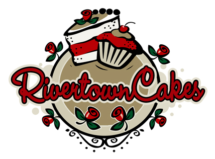
What do you guys think of this option? I'm not real concerned with the multiple color issue for getting things printed. I do my business cards either myself or through Vista Print and I print all of my own invoices, etc. Is anyone really good with Photoshop and could tweak this for me? I like this new color combo, but would be curious to see what it would look like without the roses and maybe move the scrolls up into the bottom of the circle.
I know what you guys are saying with the simpler is better, but #2 just seems really plain and boring to me for some reason.

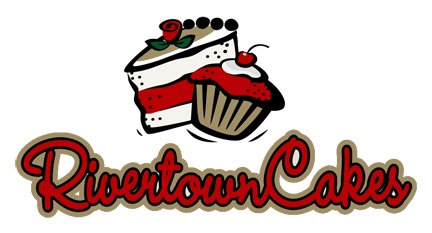
What do you guys think of this option? I'm not real concerned with the multiple color issue for getting things printed. I do my business cards either myself or through Vista Print and I print all of my own invoices, etc. Is anyone really good with Photoshop and could tweak this for me? I like this new color combo, and think the name stands out more, but would be curious to see what it would look like without the roses and maybe move the scrolls up into the bottom of the circle.
I know what you guys are saying with the simpler is better, but #2 just seems really plain and boring to me for some reason.


Both..... If you are opening up a shop, I would use Option #2 for the main sign and business cards and Option #1 for the door logo. If you use Option #1 for the business cards, it will take away from the information you are providing.
I don't know how you are going to use these logos, however. Most companies have a simple logo for their signs and business cards and then an elaborate one for the wall upon entering and/or door.

I like the revised option #2. Clean and easy to read. No need to figure out the nature of your business.
Quote by @%username% on %date%
%body%