

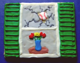
As you may remember I have been trying to design a cookie for a boy's Bar Mitzvah party. He has a reputation for breaking windows when he plays baseball. Anyway, I tried a number of different things and so far this is the version I like best. Please excuse the pathetic icing ![]() , I was using the wilton fondant writers for the shutters (since I had them on hand). For the real cookies I'll be using Antonia's RI.
, I was using the wilton fondant writers for the shutters (since I had them on hand). For the real cookies I'll be using Antonia's RI.
Please let me know what you think and how I can improve it. My daughter already said she thinks the ball needs to be a little smaller, so let me know if you agree with her.
Thanks,
Kathi
Well, I think it's just super cute! I think the baseball is fine the size it is, as a mom of a baseball boy, I know that is EXACTLY how it looks when a baseball goes through a window! Maybe consider making it look like the flower vase is falling over? I think that would be kind of funny and cute...

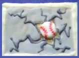
HI Kathi, I would simplify the desing, a square cookie with a big ball and the cracks arround, is more modern looking than the more literal version, and it will take you less time to make.

i think it's fantastic. and as i remember, you were trying to avoid the cookie looking ''sluttered'' which you've done very well.


I think your design is awesome! I would not make the ball smaller, detailing it would be a nightmare, I do agree with paolacaracas that you could simplify and still keep the theme-- make your decision based on time involved. He'd be thrilled with whatever you choose.

i meant ''shattered''... not sluttered. lol

I think it is so cute. I wouldn't change a thing. 
Thanks, everyone.
This photo is just cropped from the original photo, but obviously can be made square as Paola suggested. What do you think of this? Would it be too plain? If I did this version I think I would make the "pane" a bluish color, instead of gray. This would definitely be simpler. So, which do you like better?
Thanks,
Kathi

I like the design, looks like a lot of work.
I'd try something more basic if you want, decide on which one you like best and what you want to do.
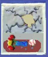
Something else that I thought of, to incorporate some of the suggestions, make the table a little larger with the baseball on the table and the vase/flower knocked over with the hole/cracks in the window where it came in.
Either way, the cookie is adorable and I'm sure they will love whatever you go with!
I love idea #2 - just the window, but if you wanted more color just outline the glass with green or red or blue - for the window pane. I think it would definately be easier than the ideas with the flowers in a vase and people will know exactly what it is!! Good luck!
Ok, #2 is a little boring but would be easier, I still love #1, but I think #3 is super cute, too... I also think a blue-ish for the window pane would be better.
How big is the cookie? I think your first picture turned out really great! A complicated design, yet the way you laid out it out, it doesn't look cluttered at all. Nice job on the uniqueness and creativity of the design. I know you said to excuse the icing part ... that happens to me all the time ... my first one is always a rough draft. I often do a cookie one, two, three times before the design, color choices, and tips all flow.
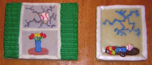
Okay below are the first cookie and the third cookie side by side as actual cookies.
The first cookie is 3.5" x 4.5". It was designed to look like the family's front window, thus the green shutters, etc. The cookie with the vase knocked over is 3" x 3.5", but could be made square (I used some extra uniced cookies and cut it down to size. I am still trying to decide if I should pour the glaze over the table, vase and ball, so you have the "behind the window" effect, but I'm afraid it will make them hard to see. ![]()
I'm meeting with the Mom tomorrow to discuss these and some other items, so I hope to bring these and get some feedback. Initially she talked about 65 of these as favors for a family dinner the night before the Bar Mitzvah. I was thinking of charging $5.00 each, although maybe only $4.00 each for the ones w/o the shutters. Does that seem fair to you?

I can't decide.
I love the detail work on the first one. But at the same time, I know a lot of people who wouldn't eat it because it's "too cute". I love the shutters and think you get the idea.
The second one, if I didn't know the details, it might take a little longer to understand the reasoning. But the second one I couldn't see people having issues with it being to cute to eat.
Does that make sense?
My vote: #1. I think the idea and detail work are very cute! And I'd be glad to wolf down any that don't make it to packaging. ![]()
Quote by @%username% on %date%
%body%