


Hi
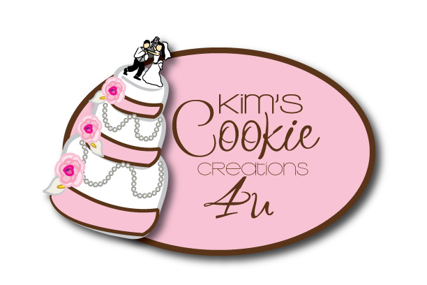
I need to choose between these 2 logos, and would appreciate your input.
They are almost identical, other than one has what I call a swoosh, which was the creators way of putting a painting creation edge towards my cookies.
Thanks all!!!
After going to preview, I noticed the "creations" is not showing up well for some reason.. anyway that is in brown as well.
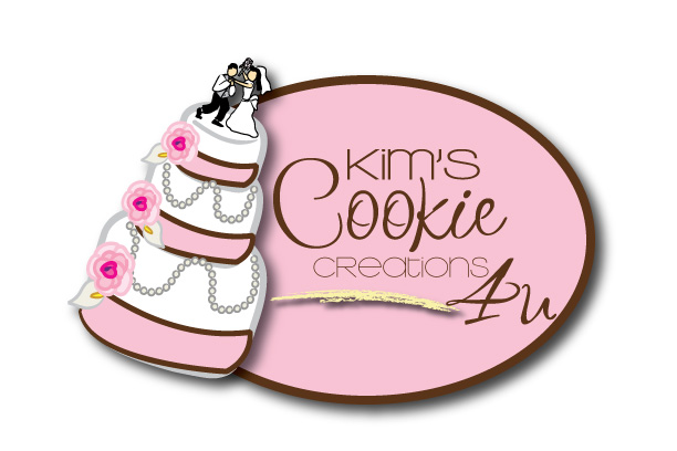


I like the second.
why is the bride choking the groom?

I like them both. Maybe you could use one for cakes and one for other items you do, like for labels and stuff...
I like the second.
why is the bride choking the groom?
wow, good eye, most people haven't noticed that the bride was choking the groom.
It's a inside family joke... but I also wanted some humor in it... just me being me...
Thanks for your input

I like the first one.... The bride and groom thing is hilarious!!
I like the first one better, too (no swoosh). And I know you didn't ask, but I think the brown is too bold on the cake.
That's okay, colors can be changed, all critisim welcomed!! That way everyone here may notice something I didn't! ![]()
Who else to run it by other than a bunch of cakers and cookie makers! ![]()

I like the first one as well. The bride choking the groom? She must know her husband REAL well!!
The only thing I would suggest is the 4U part. Its a little confusing in the font you chose. Kinda like the movie...The Oneeders instead of The Wonders!! Sorry, my husband must of watched that movie 5 times this weekend!
I like the first (without swoosh)...is it possible to change the font on the "4u"??? It took me looking at it 3 times to figure out why there was an "Au" on it....They're awesome!! Did you design or someone else's idea entirely?? Do you do cakes, too??

I like the first (without swoosh)...is it possible to change the font on the "4u"??? It took me looking at it 3 times to figure out why there was an "Au" on it....They're awesome!! Did you design or someone else's idea entirely?? Do you do cakes, too??
I agree, other than the font on 4U the rest looks pretty good ![]()
I like number 2... the swoosh is cool to me, maybe change its colors to a deeper pink... I don't know if it is just me but I had a hard time reading the word creation on both... HTH!
I like the first (without swoosh)...is it possible to change the font on the "4u"??? It took me looking at it 3 times to figure out why there was an "Au" on it....They're awesome!! Did you design or someone else's idea entirely?? Do you do cakes, too??
I found the image on istock, and then a fellow CC'er told me about this person on ebay.. So I paid her to do it.
Yes, I do cakes as well, that's kinda why I went for the cake image, since it can be a cookie or of course a cake.. and wanted to get the "wedding" clients attention as well.
All the suggestions about 4 U are spot on since I knew what it was supposed to say..didn't notice it.... After looking at it, you are right, see I knew you'd all help.
Anymore suggestions?

I agree with weirkd...just looking at the business name on your logo I would think you only did cookies. Your potential customer could mistake the cake as just a replica of a cookie. I love the logo and my choice would be the first one...the only suggestion is to substitute something else for Cookie.


I agree with what everyone has said so far. I'm a graphic designer by day... and I like it without the swoosh (#1). When it comes to logos, make it SIMPLE. make it clear - people aren't going to TRY to read it, they just need to accidentally read it... and the overall image needs to SHOW what you're saying, cuz again, they're not going to READ.
I do think you should do/say something about cakes. but I'm assuming your business name is Kim's Cookie Creations 4U - so I understand that there's nothing you can really do to change that... maybe just a '& cakes 2!' at the end. Again though, be short and to the point. Make it very easy to read.
HTH!
Jamie

I too got the cookies only impression. I was thinking it was a cake shaped cookie. The logo is very cute! (I like the 1st I would add a tagline or something that says something about cake.
I agree with what everyone has said so far. I'm a graphic designer by day... and I like it without the swoosh (#1). When it comes to logos, make it SIMPLE. make it clear - people aren't going to TRY to read it, they just need to accidentally read it... and the overall image needs to SHOW what you're saying, cuz again, they're not going to READ.
I do think you should do/say something about cakes. but I'm assuming your business name is Kim's Cookie Creations 4U - so I understand that there's nothing you can really do to change that... maybe just a '& cakes 2!' at the end. Again though, be short and to the point. Make it very easy to read.
HTH!
Jamie
you're right that is my business name, my main thing is cookies and second are cakes etc.
I will have a signature line that includes that I do cakes on my business cards etc. and on the storefront window it will include something about cakes as well.
I agree about the simpilicity of it and not having too much info on it.
Thanks again for all the input, it's greatly appreciated. ![]()
Going to send an email and get them to make a couple of changes that have been suggested. 
I really like the cake. I like the first one as well! I also liked the idea of a tag line about cakes.
The reason that the word creations looks washed out is that the font is too thin. We are used to seeing black on white and the white can't wash out the black. You might want to consider a thicker font so that the pink doesn't wash it out.
Good luck!
Don't mean to come outta left field, but I like "Kim's Cookie Creations" with the swoosh and without the "4U." The graphic artist did a really nice job & I noticed that when you blow up the image, Creations does stand out more. Maybe swap out "4U" with "and Cakes, too!" Would you pm me the ebayer you worked with? I need a logo, too. Thanks and good luck with your new logo!!
I like the first one. The yellow underline or whatever you call it makes the "4U" look like it's being shoved right out of the image. It's like there isn't enough room for the "4U". Maybe if you moved the "4U" under the yellow line.
Anyway, I like the first one. It's a very creative logo none the less.
Amy

I like the first one. The 'swoosh' makes the 4U look like its been shoved to the side!
Also, there is a capital 'R' in 'Creations', which to me looks 'off' (sorry, I've always been funny about mixing up upper and lower case, it really bugs me! LOL No offense meant though!)
Kelly
I like the first one. The 'swoosh' makes the 4U look like its been shoved to the side!
Also, there is a capital 'R' in 'Creations', which to me looks 'off' (sorry, I've always been funny about mixing up upper and lower case, it really bugs me! LOL No offense meant though!)
Kelly
Oh my, thank you for your great eye.. I didn't even notice that. I had just finished sending her my changes that I want.. had to email her again and let her know about the "R".
Thanks so much!!! ![]()
all these suggestions and proofing really helped alot!! Can hardly wait to see the changes she makes..
Quote by @%username% on %date%
%body%