


Hope ya'll can help me. Here are a couple pictures I'm thinking about using as my logo. Let me know what you think!!! Do you like the 'pencil' effect or not??
My business name is going to be 'Sugar Topped Creations'.
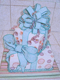
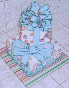
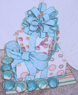
It's all the same cake, just a different view. I'm going to delete the background after I chose the pic I want.
Any suggestions??
Thanks,
Christine
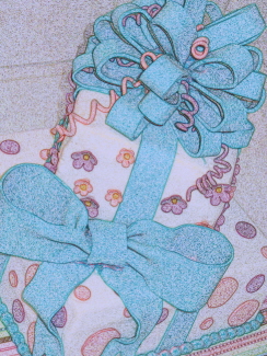


I vote for pic2, bows 016-ab. I love the 'quirkiness' of the angle and close-up! The colored pencil effect is very cool. 
Thanks everyone. I could get it narrowed down to the these four...but just couldn't decide. There is something I like with each one. But I guess I'm trying to go for a Fun-Funky kinda effect. I am thinking I'd like to have something other than a 3-tier Wedding type cake design. And this is one of my fav. cakes I've done so far. I get a lot of great comments on this cake!!!
Cakeman...I used Paint Shop Pro 9. It is the Pencil Effect.
Thanks again...and keep the comments coming!!!

I like the 1st one too~
I just made a cake like that a few weeks ago! So much fun to make!!
Good luck on your business!!!!


I'm undecided between the second and third one! What is the logo going to be put on.....i.e. signage, business cards!!!
Amy
This will be put on the main page of my website (if I can ever get it finished), business cards, brochures, stuff like that. I'm still working on a way to incorporate my name. But I thought if I could get a picture I liked it would be easier to work in my name.


I like the second one best. The angle makes it interesting as a webpage logo or where someone already already knows what you do. If you are planning to use it on cards or advertising, I would go with the first one. It is more readily recognizable as a cake.
Nice Job!

I really like 1 & 3. The only one that I really don't like is number 4 because it looks too cluttered with the things at the bottom. It's hard to tell what they are too. Cupcakes? Ususally simpler is better when it comes to things like these.

I vote for # 2. I like the angle & the closeness. Good luck!


If you want "fun funky" then go with number 2. I was leaning toward number 1 till I read your second post. The more I think about it, the more I vote number 2

I like #2, because it looks more fun and funky than the others!


Quote by @%username% on %date%
%body%