


Windsor Clikstix Letter Cutters - Examples
Decorating By Coral3 Updated 9 Dec 2012 , 4:54pm by mbark

http://cakecentral.com/gallery/2039724/christening-cake
The lettering on the cake are the script clikstix
Thank you. Not what I would envision as "script" but nice. I kind of think the regular upper and lower case are kind of "stiff" looking but these may be nicer option than groovy...if you are getting just one set. Softer looking. Just IMHO... Everyone's taste is different. I just think sometimes a cake with a lot of lettering that is regular takes away from the cake...
I still prefer fmm tappits to clickstix love the funky one and the plain one. I don't like the indents that are left on the lettering with clickstix and take the backs off them to stop it. Defeats the object really which is why I prefer FMM.

Thanks so much for sharing, I didn't realise they did letters too. I love my Funky Tappits letters but most of the time they are too big to fit on the cake. I wish they did different sizes in them.
I bought the hearts when I had to do a 4 tier cake covered in different size hearts & they were amazing. They saved me so much time, being able to cut all the different sizes out in one go. I keep meaning to buy some of the others too.
design-a-cake.co.uk are also another stockist in the UK

I still prefer fmm tappits to clickstix love the funky one and the plain one. I don't like the indents that are left on the lettering with clickstix and take the backs off them to stop it. Defeats the object really which is why I prefer FMM.
You just need to roll your fondant/gumpaste thinner and/or make sure when you're cutting out letters that you only press on the very outer edge (don't push on the ejector bit at all when cutting).

I love my Clikstix. They were easy to use and look nice too. They have nice clean edges. Just make sure you roll your fondant out thin.
I used the Upper Case Groovy set here: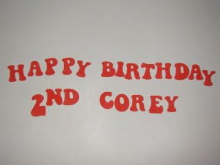

I just got the groovy lower case letters and was so excited to use them, like the look and size for certain cakes, however I got the dumb indentations on my letters! I will try either just pressing on the edges and also rolling my fondant thinner, but was disappointed these weren't a little easier to use. I LOVE my funky tappits and have no issues with them. I guess these have a learning curve too, hope I can get them to work right!
Quote by @%username% on %date%
%body%